Synopsis:
For my final project in the Media Design MFA at Full Sail I created a brand for a fictional honey company located in Central Florida. The significance of this company was to promote raw natural honey and differentiate it from the teddy bears and generic honey combs we see on the shelves. As the media designer, I was given the task of creating all of the brand identity, assets, collateral, marketing plans, target audience personas, etc. Through collecting a vast amount of research and survey results, the appropriate demographic was identified and the strategy was finalized to fit said audience.
Overview:
Honey Dew Bee Co. humbly began around early 2013 in the home of Manny Vasquez on the outskirts of Orlando. After receiving more and more foot traffic in his little home, Manny realized he needed to have a bigger space, not just for his product, but for his bees as well. It’s not hard to get lost on the way up in an effort to help everyone get a taste of the brand, but we make sure that each jar of honey is treated with the care that it deserves and the care our customers deserve. We’re a family and that’s how it’s going to stay, even when our family grows larger. Today Honey Dew Bee Co. is thriving in the heart of Orlando as they are thoroughly involved in the community and happy to be able to extend a hand to new and familiar faces alike.
The assets that will be included throughout this book will mainly revolve around print-based media that will be placed in local cafes, restaurants, farmers markets, and other places that Honey Dew Bee Co. will be supplying with only the best honey. Through creating a balance between consistent imagery and typography, Honey Dew Bee Co., will shine and leave a lasting impression.

Honey Dew Bee Co. typography was taken into long consideration, making sure it’s appealing and inviting the audience while staying professional. Purple is known as a refined and elegant color, but this darker shade was chosen to continue with the more down-to-earth and natural feeling of Honey Dew Bee Co. This color is also complimentary to the Honey Dew golden yellow color.
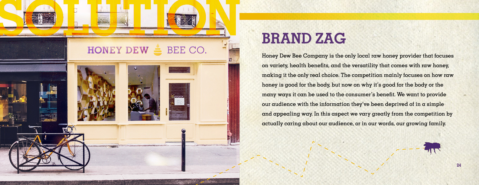
Being located in Downtown Orlando allows a broader audience to experience the joy of Honey Dew Bee Co. Continuing on with the color palette, the outside of the building will reflect the inviting personality of the brand. The thought behind mocking up this storefront was to create an area that was reminiscent of a hive.

As explained in the brand book the vehicle was chosen for its eco-friendly value, seeing as Honey Dew Bee Co. cares about the environment and keeping this as natural as possible. For the vehicle it was important to create a very light and inviting feeling so as to interest people. Honey drips from the roof to show how delectable and rich the the brand truly is.

As mentioned in the project book, Honey Dew Bee Co. prepares every jar of honey with care and a love for what they do. That being said, through the research gathered, planned strategies, collected survey results, and proposed assets, Honey Dew Bee Co., is effectively expressed as a carefully constructed and approachable brand through color, typography, and imagery.